In the following, we will look at the gapminder dataset, which contains information on life expectancy and GDP per capita for more than 140 countries over a period of more than 50 years. Based on this data, we investigate the relationship between life expectancy and economic development across the world.
library(gapminder)gapminder
# A tibble: 1,704 × 6
   country     continent  year lifeExp      pop gdpPercap
   <fct>       <fct>     <int>   <dbl>    <int>     <dbl>
 1 Afghanistan Asia       1952    28.8  8425333      779.
 2 Afghanistan Asia       1957    30.3  9240934      821.
 3 Afghanistan Asia       1962    32.0 10267083      853.
 4 Afghanistan Asia       1967    34.0 11537966      836.
 5 Afghanistan Asia       1972    36.1 13079460      740.
 6 Afghanistan Asia       1977    38.4 14880372      786.
 7 Afghanistan Asia       1982    39.9 12881816      978.
 8 Afghanistan Asia       1987    40.8 13867957      852.
 9 Afghanistan Asia       1992    41.7 16317921      649.
10 Afghanistan Asia       1997    41.8 22227415      635.
# ℹ 1,694 more rows
For plotting, we use the ggplot2 package, which is contained in the tidyverse. The fundamental building block for any plot is a call to the ggplot() function, to which we pass the data that we want to plot. On its own, this just creates a blank plot, as we haven’t specified which variables we want to plot and how we want to plot them:
library(ggplot2)p <-ggplot(data = gapminder)p
To do so, we have to specify an aestheticmapping from our data variables to the visual elements of our plot (such as positions or colors). This allows us to specify that we want to display variation in GDP along the x-axis and life expectancy along the y-axis:
p <-ggplot(data = gapminder, mapping =aes(x = gdpPercap, y = lifeExp))p
We can see that our plot now contains axis labels and ticks informed by the range of the data, but there is still no visual representation of the data, because we haven’t specified what kind of plot we want.
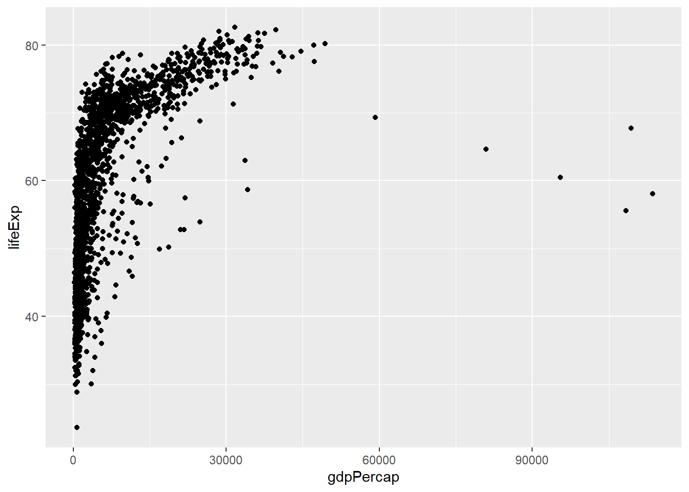
ggplot operates in terms of layers which we can add to our basic plot specification with + to include specific geometric representations of our data (such as points in a scatterplot):
p +geom_point()
At this point we have a basic plot, which we can now customize to our heart’s content.
Exercises (20 mins)
Use the jointly created code and add to it to solve the following tasks:
ggplot(gapminder, aes(x=gdpPercap, y=lifeExp, color=continent)) +geom_point() +scale_x_log10() +labs( x="GDP per capita (log scale)", y="Life expectancy (years)", title="GDP vs. life expectancy", subtitle="Data for ~130 countries over a period of 60 years")
Apply a different theme to your plot.
Solution
ggplot(gapminder, aes(x=gdpPercap, y=lifeExp, color=continent)) +geom_point() +scale_x_log10() +theme_minimal() +labs(x="GDP per capita (log scale)", y="Life expectancy (years)", title="GDP vs. life expectancy", subtitle="Data for ~130 countries over a period of 60 years")
Move the legend to the bottom of the plot.
Solution
ggplot(gapminder, aes(x=gdpPercap, y=lifeExp, color=continent)) +geom_point() +scale_x_log10() +theme_minimal() +theme(legend.position="bottom") +labs( x="GDP per capita (log scale)", y="Life expectancy (years)", title="GDP vs. life expectancy", subtitle="Data for ~130 countries over a period of 60 years")
Add a regression line to the plot.
Solution
ggplot(gapminder, aes(x=gdpPercap, y=lifeExp, color=continent)) +geom_point() +geom_smooth(method="lm", color="red") +scale_x_log10() +theme_minimal() +theme(legend.position="bottom") +labs( x="GDP per capita (log scale)", y="Life expectancy (years)", title="GDP vs. life expectancy", subtitle="Data for ~130 countries over a period of 60 years")
Save the plot as a .png file.
Solution
p1 <-ggplot(gapminder, aes(x=gdpPercap, y=lifeExp, color=continent)) +geom_point() +geom_smooth(method="lm", color="red") +scale_x_log10() +theme_minimal() +theme(legend.position="bottom") +labs( x="GDP per capita (log scale)", y="Life expectancy (years)", title="GDP vs. life expectancy", subtitle="Data for ~130 countries over a period of 60 years") ggsave("gdp-lifeexp.png", p1, width=30, height=20, units ="cm")
Visualize the population development by continent. Think about what you would want the plot to look like first and then identify the corresponding geom_*.
Solution
dat <- gapminder |>group_by(year, continent) |>summarize(pop=sum(pop))ggplot(dat, aes(x=year, y=pop, color=continent)) +geom_line() +theme_minimal() +theme(legend.position="bottom") +labs(x="", y="Population", title="Population growth by continent")